LINK WEBSITE

Striking the perfect balance.
How strong art direction
enhances User Experience.
Supporting LINK’s Digital Evolution.
LINK is a not-for-profit organisation best known for providing the network infrastructure that connects together much of the UK’s ATM network. In recent years however, their remit has become much broader, and that’s required the organisation to actively shift its perception – from anonymous financial institute to champion for cash users, especially marginalised communities.
The challenge.
As the UK continues to rapidly transition to digital payments, LINK needed to somehow balance being relevant in an increasingly cashless society, but also maintain their vital role in ensuring universal access to cash. Their website, as their most public-facing channel, would be instrumental in helping to drive this transformation.

Audiences & device-priorities.
LINK’s website audiences and the way they interact with the website is hugely diverse. Members of the public are generally looking to find their nearest ATM. They need a quick transaction and are likely using their mobile phone.
Meanwhile, politicians, policy-makers and financial professionals need a much deeper level of information. They may be analysing detailed research or planning long-term cash provision, so it’s essential that they can search, browse and navigate the site and find the exact information they’re after.
Discovery & Strategy.
Through four in-depth workshops with LINK team members across the business, we developed:
- A clear understanding of LINK’s desired brand voice and proposition
- Detailed audience personas and optimised user journeys
- A comprehensive creative brief aligned with their new positioning
- A new content strategy that combined existing and new material

Creative & Content Strategy.
We believe that an outstanding user experience requires equal attention is paid to both design and content. So, as soon as the initial discovery was complete, our creative team worked simultaneously on both designing the user interface (UI) and art directing / producing the visual content. The result? A user experience that perfectly melds design and content.
Design System & User Experience:
- Developed a comprehensive design system with detailed UI components
- Created intuitive navigation paths for different user groups
- Implemented enhanced usability features including an FAQ chatbot and Help Centre
- Built-in feedback mechanisms to support continuous improvement
- Compliance with WCAG 2.0 level AA accessibility standards


Content & Visual Strategy:
- Collaborated with LINK’s content writers to create more accessible and engaging content
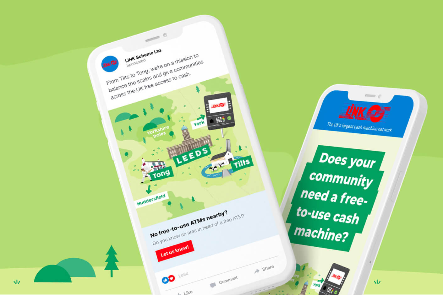
- Planning and art directing photography shoots, capturing authentic moments, rather than relying on legacy assets or cliched stock photography
- Developed a fresh illustrative style to clarify complex information
- Ensured all content supported LINK’s new, more approachable positioning


What they say
“Just wanted to say a huge thank you for your work on the website redesign.”
“As hoped, it looks crisp, it provides good user journeys, with a clear brand message. The design has been a hit throughout the process, and delivered really effectively. All feedback so far has been super positive.”
Nick Quin – Head of Financial Inclusion


Impact & Results.
The redesign has transformed LINK’s digital presence, with improved metrics across all key performance indicators.
However, of equal importance was the success in balancing a redesign of the user journeys with strong, visual and compelling content that’s helping change the perception of LINK.

LIKE WHAT YOU SEE?
Let’s connect.